The Beginner’s Guide to Color Mixing
The Beginner’s Guide to Color Mixing
Color mixing may look complicated, but once you understand a few simple principles, it becomes one of the most enjoyable parts of creating. Whether you’re working on an art project, choosing paint colors for your home, or designing graphics, knowing how to blend colors gives you complete control over your palette.
This guide will walk you through the basics of color mixing, show you how to adjust and perfect your mixes, and help you avoid common mistakes—while also explaining the why behind how color influences your mood and space.
Understanding the Color Wheel
The color wheel is the foundation for mixing. Every color you’ll ever create begins here.
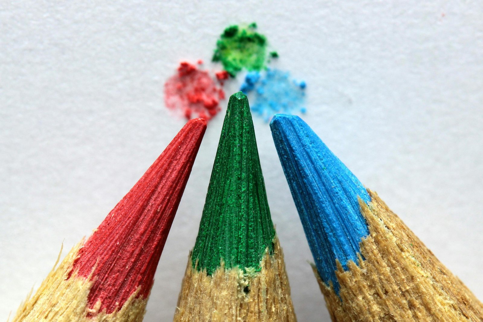
Primary Colors
Red, Blue, Yellow
These cannot be made by mixing other colors and are the building blocks for every other hue.
Secondary Colors
Created by mixing two primary colors:
- Red + Yellow = Orange
- Blue + Yellow = Green
- Red + Blue = Purple
Tertiary Colors
Mix a primary and a neighboring secondary color to create blends like red-orange, blue-green, or yellow-green.
Once you understand these relationships, you can predict how colors will behave when mixed.
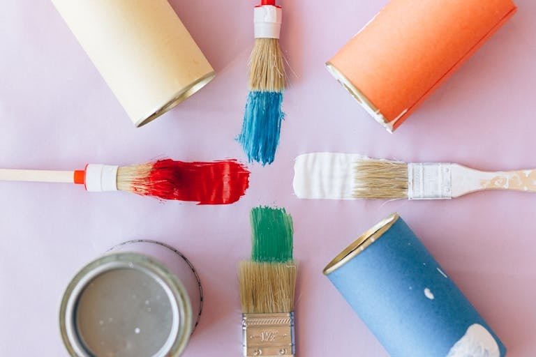
How to Mix Colors Step-by-Step
Start With High-Quality Primaries
Good pigments produce clean mixes. Poor-quality colors often turn muddy, no matter how carefully you mix.
Helpful Pick: Liquitex Basics Primary Paint Set – dependable pigments that create clean, accurate blends.
Mix Gradually
Always add the darker or stronger color into the lighter one—never the other way around.
It prevents overpowering the mix and gives you more control.
Track Your Ratios
Example:
1 part blue + 2 parts yellow = bright green
2 parts blue + 1 part yellow = deeper, cooler green
Keeping notes helps you repeat your favorite mixes consistently.
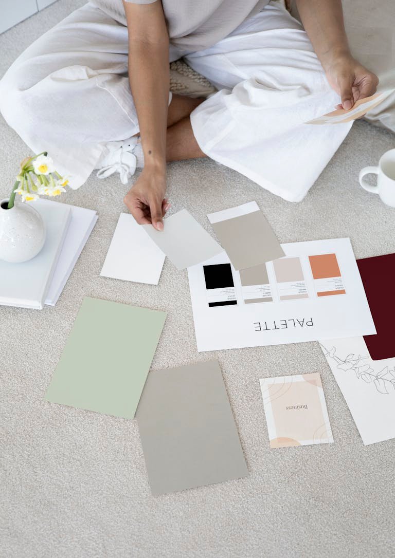
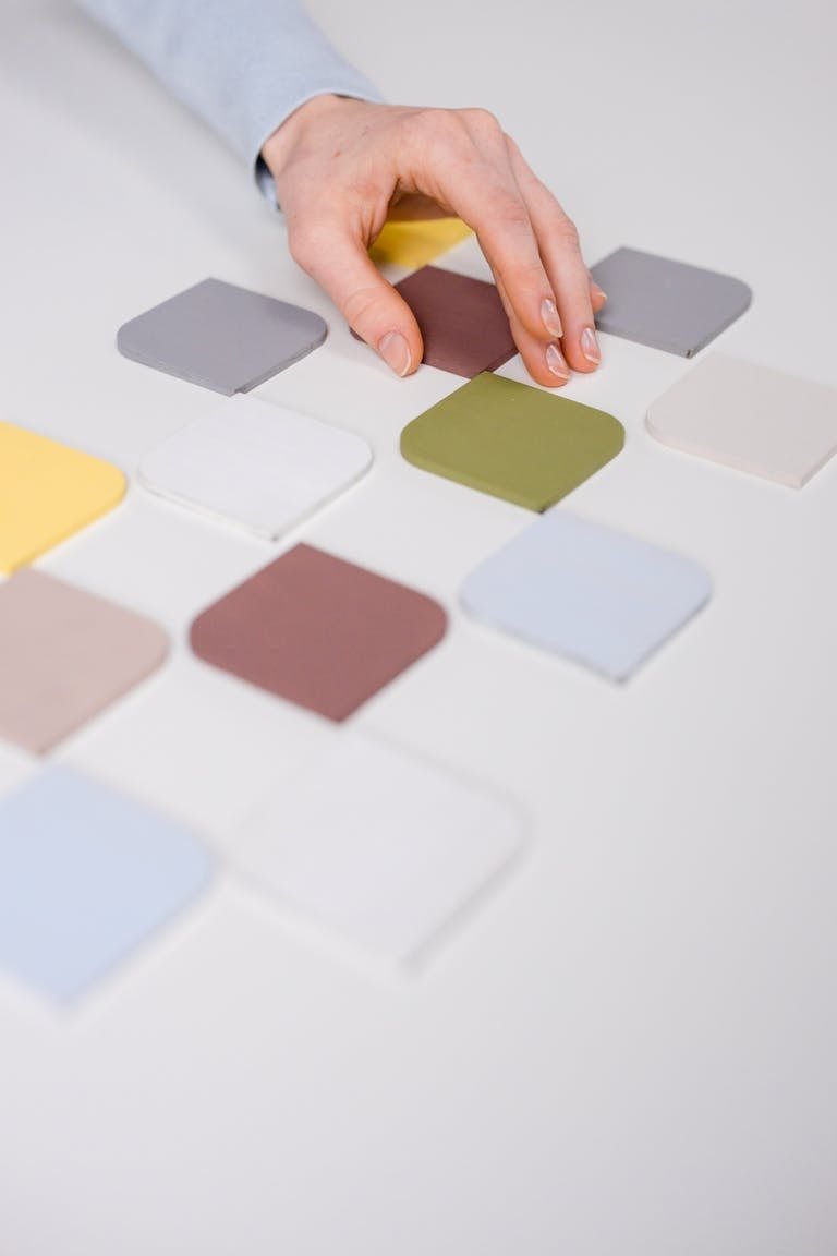
Making Tints, Shades, and Tones
Understanding these three adjustments gives you total control over depth and mood:
- Tint: Add white to lighten (creates soft, airy pastels)
- Shade: Add black to darken (adds richness and dramatic depth)
- Tone: Add gray to soften (perfect for sophisticated or subtle color schemes)
These variations are the secret to professional-looking work—whether on canvas, walls, or digital designs.
The Psychology Behind Mixed Colors
Color isn’t just visual—it impacts emotions, energy, and perception. Understanding how mixed tones affect mood makes your choices more intentional.
- Light tints feel calm, peaceful, and open.
- Deep shades feel grounding, dramatic, or cozy.
- Muted tones feel sophisticated, balanced, and relaxing.
- Vibrant, high-saturation mixes feel energetic, creative, and happy.
For example:
- Mixing lavender (blue + red + lots of white) creates a soothing, sleep-supporting shade.
- Deep teal (blue + green + gray) promotes focus and emotional balance.
- Coral (red + yellow + white) feels cheerful and uplifting.
This helps you choose the right mix for your home décor, art, or design mood.
Common Color Mixing Mistakes (and How to Fix Them)
Mistake 1: Colors Turn Muddy
Why it happens:
You accidentally mixed all three primaries—especially when mixing warm and cool versions of the same color.
Fix:
Use pure primaries. If possible, choose “cool primaries” for clean purples and “warm primaries” for clean oranges.
Mistake 2: Overmixing
Too much blending removes vibrancy.
Fix:
Mix until combined, then stop. A palette knife helps prevent overworking.
Mistake 3: Undetected Undertones
A warm blue + a cool yellow won’t produce the same green as cool blue + warm yellow.
Fix:
Test small swatches on paper first to see undertones before committing.
Mistake 4: Not Considering Lighting
Colors can look drastically different in artificial light.
Fix:
Always check your mix in natural daylight.
Helpful Pick: Stainless Steel Palette Knife Set – perfect for clean, controlled mixing without muddy results.
Pro Artist Tips for Mixing Like a Professional
These small habits dramatically improve your results:
- Test every mix in daylight: Artificial light skews color.
- Start with small amounts: It’s easier to darken than lighten.
- Use a palette knife, not just brushes: Brushes trap leftover pigment.
- Create a swatch library: Keep a notebook of every mix you make.
- Warm + cool color awareness:
- Warm Red + Warm Yellow = vivid orange
- Cool Red + Cool Blue = clear, bright purple
- Keep a “neutral jar”: Combine leftover paint to make beautiful custom neutrals.
Small pro habits → big improvement in your final result.
Quick Reference Mixing Guide
- Peach: Red + Yellow + White
- Teal: Blue + Green + a hint of Gray
- Lavender: Blue + Red + lots of White
- Mint: Blue + Yellow + White
- Coral: Red + Yellow + a touch of White
Helpful Pick: Artist Mixing Journal – great for tracking ratios and swatches.
Mixing is Simple and Fun
Color mixing becomes simple and fun once you understand primary relationships, temperature, and the psychology behind your blends. With a few tools, the right techniques, and some practice, you’ll be able to create any color you imagine—and control the mood it brings into your art, décor, or design projects.