Best Paint Colors for Small Spaces (And Why They Work)
Best Paint Colors for Small Spaces
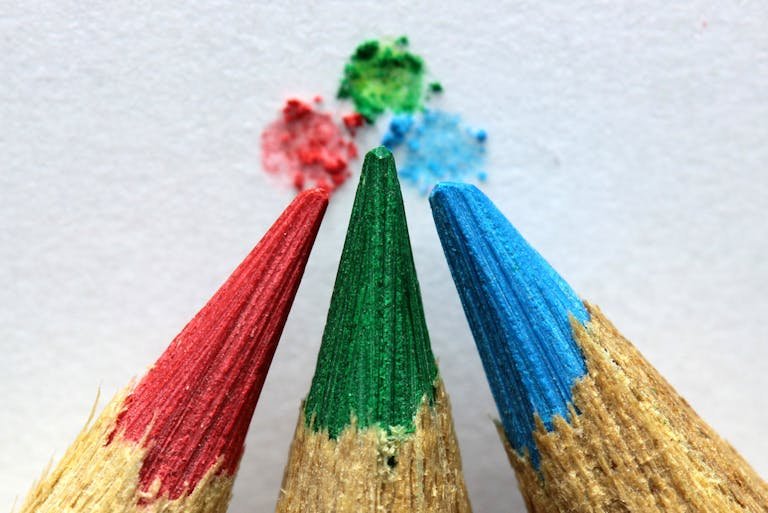
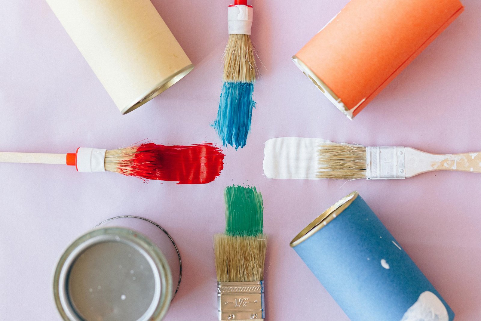
Small spaces don’t have to feel cramped or limiting—the right paint colors can completely transform how a room looks and feels. Whether you’re working with a studio apartment, a small bedroom, or a cozy office nook, choosing the right shade can make your space feel larger, brighter, and more inviting.
Here are the best paint colors for small spaces—and why they work so well.
1. Crisp White – The Illusion of Space
White is the ultimate go-to for small rooms. It reflects light beautifully, blurs edges, and creates an airy feel that instantly makes a space look larger.
- Why it works: White maximizes natural light and pairs effortlessly with any décor.
- Pro tip: Use different shades of white (warm vs. cool undertones) depending on your lighting.
Helpful Pick: Try Interior Matte White Paint & Primer – a customer favorite for clean, modern walls with a smooth finish. Pair it with ScotchBlue Painter’s Tape for crisp, professional edges.
2. Soft Blue – Calm & Expansive
Light blues bring the serenity of the sky and sea indoors. They create a sense of openness and calm, which is perfect for small bedrooms or bathrooms.
- Why it works: Cool tones visually recede, tricking the eye into thinking the walls are farther away.
- Pro tip: Pair with crisp white trim for a fresh, timeless look.
Helpful Pick: Prestige Interior Paint in Sky Blue offers a soft, airy blue that instantly brightens a small room. Add Chalk Finish Paint in “Morning Mist” to refresh a nightstand or dresser for a cohesive look.
3. Pale Green – Natural & Refreshing
A soft green brings the outdoors in, adding freshness and life to a compact space.
- Why it works: Green strikes a balance—it’s light enough to open up a room but adds more warmth than blue.
- Pro tip: Works beautifully in kitchens or offices where focus and energy matter.
Helpful Pick: Select Matte Pale Green (sample size) gives you a natural yet airy look. To complete the effect, add indoor-friendly plants like the Costa Farms Live Peace Lily for a refreshing touch of nature.
4. Light Blush – Warm & Airy
Soft pink tones (think blush or dusty rose) can warm up a small room without overwhelming it.
- Why it works: Adds subtle color while still reflecting plenty of light.
- Pro tip: Style with gold or brass accents for a chic, modern vibe.
Helpful Pick: Try Matte Interior Chalked Paint in Blush Pink for walls or accent furniture. Pair it with Prisma Decorative Wall Mirror in gold to add a sense of depth and elegance.
5. Light Gray – Modern Neutral
Gray offers sophistication and flexibility. Light gray walls act like a neutral backdrop but add depth compared to stark white.
- Why it works: It’s versatile—pairs well with bold or soft accent colors.
- Pro tip: Use gray in living rooms or offices where you want a calming yet polished feel.
Helpful Pick: Interior Paint and Primer in Dove Gray delivers a smooth modern finish. Complement the walls with Ceramic Table Lamp for a soft, ambient glow.
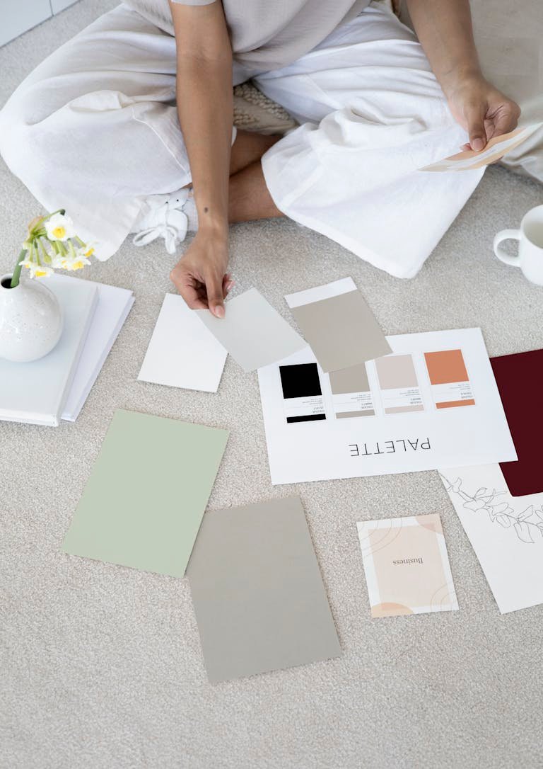
Expert Tips & Design Hacks for Small Rooms
- Lighting matters: Natural light makes colors appear softer and more expansive, while artificial light can shift undertones. Always test swatches in daylight and evening light before committing.
- Ceiling tricks: Painting ceilings a lighter shade than the walls creates an illusion of height. Want bold drama? Paint the ceiling the same color as the walls to blur edges and make the room feel cozy but not smaller.
- Accent walls: Be careful—dark accent walls in small spaces can sometimes shrink a room. Instead, choose a softer complementary shade that enhances depth without overwhelming.
Helpful Pick: Use Hue Smart Bulbs to adjust your lighting temperature. You’ll see how paint colors shift in different light before making a final decision.
The Psychology of Small-Space Colors
Color doesn’t just affect how a room looks—it affects how you feel inside it:
- White: Promotes clarity and openness; perfect for fresh starts.
- Blue: Calming and expansive, lowers stress levels.
- Green: Restorative and balancing; helps focus and productivity.
- Pink/Blush: Comforting and nurturing, adds warmth without intensity.
- Gray: Creates sophistication and calm, reducing visual clutter.
Designers often use these shades not just for aesthetics but for mood management—turning small spaces into functional, uplifting environments.
Helpful Pick: For inspiration, flip through The Color Scheme Bible by Anna Starmer – a highly rated guide with 200+ palettes for home design.
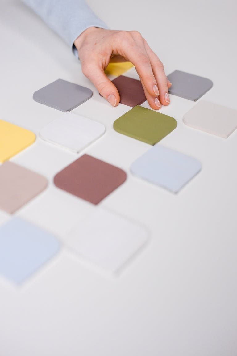
Quick Palette Ideas for Small Spaces
- White + Navy + Gold → Elegant and timeless
- Soft Blue + White + Natural Wood → Coastal and calming
- Pale Green + Beige + Cream → Fresh and balanced
- Light Gray + Charcoal + Blush → Modern and cozy
Expand Your Eye for Color
The best paint colors for small spaces are those that play with light, expand the eye, and support your mood. From crisp whites to calming blues and refreshing greens, these shades can transform a tiny room into a bright, welcoming retreat.
Tip: Test a paint sample on your wall in both daylight and nighttime lighting before making your final choice—it makes all the difference.
Helpful Pick: Try an Inexpensive Paint Sampler Kit to test multiple shades before committing. It saves money and frustration.